coin360 Review
coin360
coin360.com
Coin360.com: Simplify Your Crypto Journey with Live Prices and Heatmaps
Do you ever feel lost trying to keep up with the constantly changing world of cryptocurrencies? With so many coins and data points, it's easy to get overwhelmed. What if there was a way to see all the essential information in one place?
The Challenge of Staying Updated in the Crypto World
As someone deeply involved in the cryptocurrency space, I know how quickly the market moves. New coins emerge, prices fluctuate by the minute, and keeping track can feel like chasing a moving target. Jumping from site to site just to check prices, market caps, and trends wastes valuable time and can lead to missed opportunities.
Coin360.com Offers a Solution
That's where Coin360.com comes in. It's a platform that brings all the crucial crypto data together in one easy-to-use interface. Instead of juggling multiple tabs and websites, you can find live prices, market caps, and more, all in one place. This means less time searching and more time focusing on what matters—making informed decisions.
Why This Matters to Crypto Enthusiasts
Whether you're a seasoned trader, a new investor, or just curious about cryptocurrencies, having quick access to accurate market data is essential. Understanding how to efficiently access this information can give you an edge in the fast-paced crypto market.
So, how exactly does Coin360.com streamline this process, and what features make it stand out? Let's explore this together.
Getting to Know Coin360.com
When I first stumbled upon Coin360.com, it felt like I'd finally found the missing piece in my crypto journey. In a world overflowing with numbers and stats, having a tool that cuts through the noise is refreshing. Let's check out what makes Coin360.com stand out in the crowded crypto space.
An Intuitive Heatmap Interface
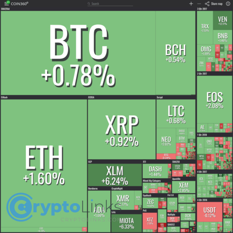
The first thing that grabs your attention is the heatmap. It's like having a live, visual snapshot of the entire cryptocurrency market right before your eyes. Each cryptocurrency is represented as a block, and these blocks vary in size and color based on their market performance.
Imagine logging in and instantly seeing Bitcoin's block glowing green and larger than others, signaling a price uptick and its dominant market cap. If Ethereum is having a rough day, its block might appear smaller and redder. This immediate visual cue saves so much time compared to sifting through endless charts and tables.
The heatmap isn't just eye-catching; it's practical. It turns complex data into an accessible format that even those new to crypto can appreciate. It's like reading the mood of the market with just a glance.
Real-Time Cryptocurrency Prices
We all know how quickly crypto prices can swing. Missing out on a crucial price movement by even a few minutes can make a big difference. That's why Coin360.com's real-time price updates are such a game-changer.
No more constant refreshing or hopping between different sites to compare prices. With Coin360.com, the live updates flow seamlessly, so you're always in the know. Whether you're tracking the surging price of a trendy altcoin or monitoring Bitcoin for the perfect entry point, having real-time data at your fingertips is invaluable.
"Simplicity is the ultimate sophistication." - Leonardo da Vinci
This quote perfectly captures what Coin360.com brings to the table. By simplifying complex data into an elegant interface, it elevates our ability to understand and react to the market.
Excited about how this tool can make crypto tracking easier? There's even more to uncover. Ever wondered how to get the most out of that heatmap and tailor it to your interests? Let's explore that next.
Navigating the Live Heatmap
When I first stumbled upon Coin360.com's live heatmap, I felt like I'd unlocked a secret weapon in the crypto world. This visual tool transforms heaps of complex data into an easy-to-understand format, making my daily crypto check-ins so much smoother. Let me walk you through how to navigate this game-changing feature.
Understanding Color Indicators
At first glance, the heatmap might look like a colorful mosaic. Each block represents a cryptocurrency, but it's the colors and sizes that tell the real story. Here's how to make sense of it:
- Green Blocks: These indicate that a coin's price has increased over the selected time frame. The brighter the green, the larger the gain.
- Red Blocks: These show that a coin's price has decreased. The deeper the red, the bigger the loss.
- Block Sizes: The size of each block correlates with the coin's market capitalization. Bigger blocks mean larger market caps.
It's amazing how quickly you can grasp the market's mood just by glancing at these colors. As the saying goes,
"A picture is worth a thousand words,"
and in this case, it's worth thousands of data points.
Customizing Your View
One of my favorite features is the ability to tailor the heatmap to my interests. Here's how you can make it work for you:
- Filter by Time Frame: Want to see how coins performed in the last hour, day, or week? Adjust the time settings to zoom in or out on market movements.
- Select Specific Exchanges: If you prefer data from certain exchanges, you can choose to display only those.
- Focus on Types of Coins: Interested in DeFi tokens or stablecoins? Use the filters to highlight specific categories.
- Customize Currency Display: View prices in USD, BTC, ETH, or other currencies to suit your analysis.
By personalizing the heatmap, you're not just observing the market—you're engaging with it on your terms. It's like having a dashboard that reflects exactly what you care about.
Feeling excited about how this tool can empower your crypto journey? Just wait until we explore how understanding market caps can reveal the potential and stability of your favorite coins.
Exploring Market Caps on Coin360.com
Market capitalization might sound like a mouthful, but it's actually a simple and powerful concept in the crypto world. On Coin360.com, understanding market caps becomes an easy and visual experience. Let's see how this works and why it matters.
Comparing Cryptocurrencies by Market Cap
Imagine opening Coin360.com and seeing that colorful heatmap filled with blocks representing different cryptocurrencies. Did you know that the size of each block isn't random? It's based on the market cap of that coin. The bigger the block, the larger the market cap.
For example, Bitcoin usually has the largest block on the heatmap, showing its position as the top cryptocurrency by market cap. Ethereum follows with a sizable block of its own. Then you'll see smaller blocks for coins like Binance Coin, Cardano, and others. This visual layout lets you quickly compare the sizes of different cryptocurrencies without diving into complicated charts or spreadsheets.
It's like walking into a bookstore where the bestsellers are prominently displayed, catching your eye immediately, while the niche titles are still there but need a bit more searching.
Why Market Cap Matters
So, why is market cap so important? It gives us a snapshot of a cryptocurrency's total value in the market, acting as an indicator of its popularity and potential stability. A higher market cap often means the coin is more established and possibly less volatile. It's similar to the difference between investing in a well-known company versus a brand-new startup.
"Understanding the market cap is like reading the pulse of the crypto market." – A seasoned trader
By looking at market caps, you can gauge the relative size and importance of different cryptocurrencies. This helps in assessing risk and making informed decisions. For instance, smaller market cap coins might offer higher growth potential but come with greater risks. On the other hand, larger market cap coins might provide more stability but with slower growth.
Coin360.com's visual representation means you don't have to wade through endless data to get this insight. It's all right there in front of you, making it easier to decide where to focus your attention.
But market cap is just one piece of the puzzle when navigating the crypto landscape. Curious about what other features Coin360.com has to offer that can enhance your understanding and strategy? There's so much more to explore that'll help you stay ahead in the game.
Additional Features Worth Exploring
While Coin360.com's heatmap and real-time prices are fantastic, there's more to this platform that's worth checking out.
Historical Data and Charts
Ever wondered how Bitcoin's price has changed over the past year? With Coin360.com's historical data and charts, you can explore price movements over various time frames. The interactive charts make it easy to spot trends and patterns. For example, during the 2021 bull run, seeing Ethereum's steady climb on the charts might have given you the confidence to invest or hold onto your coins.
These visual tools aren't just for the big players either. If you're interested in emerging altcoins, the historical charts can help you understand their volatility and growth potential. It's like having a time machine that shows you how a coin has performed, helping you make more informed decisions.
News and Updates Integration
In the crypto world, news can change everything in an instant. Coin360.com keeps you in the loop by integrating the latest news and updates directly into the platform. No more jumping between sites to see if a coin is pumping because of a major announcement or crashing due to unforeseen events.
Imagine spotting a sudden spike in a coin's price on the heatmap. With the integrated news feed, you can immediately check if there's a reason behind the movement—maybe a new partnership, a hack, or regulatory news. Staying informed in real-time can be the difference between capitalizing on an opportunity or missing out.
"Information is the oxygen of the modern age. It seeps through the walls topped by barbed wire; it wafts across the electrified borders." - Ronald Reagan
Having instant access to both data and news empowers you to breathe easy in the often suffocating sea of information overload.
But what if you could streamline your crypto experience even more? In the next part, I'll share how Coin360.com can become your daily go-to tool, making your journey through the crypto landscape smoother and more efficient.
How Coin360.com Enhances Your Crypto Experience
Ever felt like you're juggling too many things at once when tracking cryptocurrencies? Trust me, I've been there. Coin360.com has been a game-changer for me, and I want to share how it can make your crypto journey smoother and more enjoyable.
Saving Time with Centralized Information
One of the biggest hassles in crypto trading is hopping between different websites to get all the data you need. With Coin360.com, that hassle disappears. Everything is right there on a single platform. Imagine checking real-time prices, market caps, and even the latest news without switching tabs.
For example, instead of opening one site for Bitcoin prices, another for Ethereum charts, and yet another for market news, Coin360.com brings it all together. This not only saves time but also reduces the chances of missing out on crucial information.
Making Informed Decisions
Having all this data at your fingertips means you're better equipped to make smart decisions. The comprehensive insights provided by Coin360.com can help you spot trends and analyze the market more effectively.
The visual heatmap allows you to quickly see which coins are gaining and which are losing ground. This immediate visual feedback can be vital when you're considering your next move. Studies have shown that visual data representations can enhance decision-making by up to 70% because they make complex information easier to understand.
Also, with access to historical data and interactive charts, you can track performance over time and adjust your strategies accordingly. It's like having a personal assistant that keeps you informed and ahead of the curve.
But here's the thing: the crypto world is always evolving, and staying ahead requires the right tools.
Curious about what else can boost your crypto journey? In the next part, I'll share some additional resources that complement Coin360.com perfectly. Stay tuned!
Exploring Other Helpful Resources
While Coin360.com has become a staple in my crypto toolkit, I've found that using it alongside other platforms can give an even fuller picture of the market. Let me share a few resources that I've found helpful for deeper analysis.
Other Platforms Worth Checking Out
- CoinMarketCap: This is one of the go-to sites for many crypto enthusiasts. It offers detailed rankings, extensive historical data, and a wealth of metrics that help me understand the nuances of different cryptocurrencies. When I want to dig into a coin's background or check out its market pairs, CoinMarketCap is where I head.
- TradingView: If you're interested in technical analysis, TradingView is an invaluable resource. It provides advanced charting tools and a community where traders share ideas and strategies. I've used it to spot trends and set up alerts for price movements, which has been incredibly useful in timing my trades.
Combining the visual clarity of Coin360.com with the in-depth data from these platforms has made my research more comprehensive. Each tool offers something unique, and together they help me make more informed decisions.
Final Thoughts
Keeping up with the fast-paced crypto market doesn't have to be a daunting task. For me, Coin360.com has simplified the process, making it easy to stay updated without feeling overwhelmed. Its user-friendly interface and real-time data have been game-changers in how I approach crypto trading and investing.
If you haven't already, give Coin360.com a try and see how it fits into your crypto routine. And don't hesitate to explore other resources like CoinMarketCap and TradingView to complement your research. Finding the right set of tools can make all the difference in your crypto journey.
Happy exploring, and here's to making well-informed decisions in the exciting world of cryptocurrency!
Dive deeper into Coin360.com and other top crypto tools at CryptoLinks.com, where you’ll find expert reviews, trusted resources, and the latest insights to elevate your trading game. Explore now and take control of your crypto adventure!

