Coin360 Review

Coin360
coin360.com
COIN360 Review Guide: Everything You Need to Know + FAQ
How many minutes do you burn every morning clicking through CoinMarketCap, CoinGecko, and a dozen charts—only to feel blind to the bigger trend? If that sounds familiar, you’ll like what I’m about to show you.
COIN360 is famous for its real-time crypto heatmap. In seconds, it turns the entire market into color and size so you can spot what actually matters—no noise, no fluff. I use it to cut through the overwhelm, see money flows fast, and stop second-guessing my first read.
Humans detect color and size changes in under a quarter of a second. That preattentive snap is exactly why a good heatmap works—your brain sees clusters and outliers before you “think.”
What’s broken with most crypto dashboards
Most market pages make you work way too hard. You get tables, tiny sparkline charts, and ad clutter. Great for research, terrible for fast decisions. Here’s what slows everyone down:
- Overload: Columns of numbers that force you to read, not see.
- No sense of scale: A 10% move on a micro-cap looks as “important” as a 2% move on BTC if you’re just skimming lists.
- Tab sprawl: Market overview here, sector view there, volume somewhere else—you assemble the picture manually.
- Ad distractions: Visual noise everywhere when you need clarity the most.
- Slow context switch: Switching timeframes or filters usually means more clicks and more guesswork.
That friction isn’t just annoying; it’s costly. Visual cognition research consistently shows that clear, preattentive cues (like color intensity and area) improve pattern recognition and reduce decision time. In plain English: if the tool shows you the market right, you act faster and with more confidence.
Here’s a quick real-world example of why that matters:
- Example: On a recent macro news day, BTC went flat after the event. A text list made it look like “nothing’s happening.” On the COIN360 heatmap, large-cap AI and DeFi tiles were flashing green together on the 1h and 24h view—clear, sector-wide rotation. That visual cluster saved me 10 minutes of clicking and told me exactly where to look next.
What I’ll help you solve
I’m going to show you how to use COIN360’s heatmap to get a market-wide read in under 60 seconds. You’ll see the best filters, the timeframes that matter, and how to spot real moves vs. noise. I’ll also point out where COIN360 fits next to CoinMarketCap, CoinGecko, and TradingView—so you’re not expecting it to do what it wasn’t built for.
By the end, you’ll have a repeatable process you can run every morning or before placing a trade:
- Scan faster: Color for direction, size for impact, volume for conviction.
- Compare clearly: See sectors move together, not just coin-by-coin randomness.
- Focus better: Cut the market to a shortlist without five extra tabs.
Who benefits from this
- Beginners: If numbers-heavy dashboards feel overwhelming, the heatmap will make the market click for you.
- Active traders: If you need quick macro context before drilling into charts, this is your speed read.
- Analysts and creators: If you produce briefs, you’ll love the shareable snapshots and clean visual narrative.
Whether you check the market twice a day or twenty times, having a high-signal “first look” keeps you from chasing random moves. It’s the difference between reacting to headlines and seeing the story the data is already telling.
Quick verdict
COIN360 is one of the fastest ways to understand crypto market mood in real time. It won’t replace your portfolio tracker or your deep charting, but as a visual scanner, it’s excellent. If you’ve ever wished for a one-glance answer to “what’s moving and does it matter?”, the heatmap nails it.
Curious what COIN360 actually is under the hood and who it’s best for? Let’s answer that next—ready for a quick, no-fluff overview?
What is COIN360 and who is it for?
COIN360 at a glance
COIN360 is a real-time crypto heatmap and market visualization site that makes market-wide moves obvious in seconds. It turns the entire market into a living treemap: each coin is a tile, color shows price change, and size shows impact (market cap or volume). The effect is instant clarity—what’s up, what’s down, and what actually matters right now.
On a typical Monday open, I’ll set the timeframe to 24h and immediately spot sector behavior: maybe Bitcoin is slightly red, but a cluster of L2s is bright green and growing in size on volume. That’s a visual “rotation” signal you can act on—without clicking 50 pages.
“Overview first, zoom and filter, then details-on-demand.”
— Ben Shneiderman
COIN360 nails that mantra. Start with the overview (heatmap), zoom with filters (market cap tiers, categories, exchanges), then drill into a coin page only if it earns your attention.
Who should use it
If you need fast context before you make a decision or open your charting tool, this is built for you. I use it whenever I want market signal without noise.
- Day traders: Get the 1h pulse, spot momentum clusters, and see where liquidity is moving. Example: switch sizing to volume and watch which tiles suddenly inflate—those are venues where money is flowing now.
- Swing traders: Cross-check 7d trend vs 24h context to avoid fighting the bigger move. If a coin is green on 7d but cooling on 24h, you may be looking at a pullback rather than a breakdown.
- Analysts and researchers: Use the heatmap to form a macro hypothesis (e.g., “DeFi strength across large/mid caps”), then move to your research stack to validate fundamentals.
- Curious investors: Learn the market’s mood in a glance without getting overwhelmed by spreadsheets or endless tabs.
Human–computer interaction research backs this up: color and size are “preattentive” visual cues, meaning your brain processes them almost instantly. That’s why a heatmap helps you scan faster than tables of numbers. If you’re curious, here’s a good read from Nielsen Norman Group on preattentive attributes in visualization.
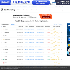
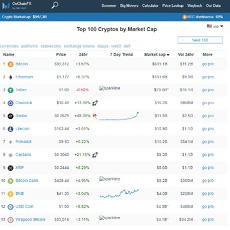
How it differs from CoinMarketCap and CoinGecko
Think of these tools as complementary rather than substitutes:
- COIN360: A visual market scanner for speed and signal. You see the whole battlefield at once, filter quickly, and spot patterns (sector surges, capital rotation, outliers) without friction.
- CoinMarketCap / CoinGecko: Encyclopedic listings and deep token pages: circulating vs max supply, contract addresses, historical data, market pairs, and more.
Real-world flow for me looks like this: COIN360 for the “what’s moving and where,” then CMC/Gecko for fundamentals like tokenomics and listings, and finally my charting platform for entries and risk. When memecoins went on a tear recently, the heatmap showed a block of small/mid caps turning solid green with ballooning volume-sized tiles—minutes before timelines caught up. I pivoted attention there, then validated details on the token pages elsewhere.
Key pros and cons
- Pros
- Instant overview: See market mood at a glance with color/size encoding that cuts through noise.
- Clean filters: Focus by market cap groups, categories (L1, L2, DeFi, AI, etc.), or hide stablecoins so they don’t dominate the view.
- Timeframes that matter: Quick toggles for 1h, 24h, 7d help you separate momentum from trend.
- Watchlist-friendly: Keep a “core” map for your main holdings and a separate “discovery” map to spot new opportunities.
- Volume sizing: Switch from market cap to volume to instantly see where actual money is moving.
- Cons
- Not a full research suite: You’ll still want CMC/Gecko for tokenomics, historical snapshots, and exhaustive listings.
- Limited advanced charting: Great for sanity checks, not for building complex strategies or custom indicators.
- You’ll pair it with other tools: Treat it as your radar. Use separate tools for deep TA, on-chain analytics, alerts, and portfolio/tax tracking.
Bottom line: if you ever feel that “too many tabs, not enough signal” feeling, a heatmap-first scan can bring calm and focus. As I like to say, clarity is a position.
Ready to read the map like a pro? Up next, I’ll show you how color, size, and timeframes work together—and the one filter most people miss that instantly cuts false signals. Ever wondered whether to size tiles by market cap or volume for momentum hunting? Let’s settle it.
The heatmap: how to use it like a pro
Reading colors and sizes
Think of the heatmap as a market X‑ray. Color = price change for the timeframe you choose; size = importance (by market cap or volume, depending on your setting). Green means up, red means down, grey is roughly flat. The stronger the shade, the bigger the move.
By default, tile size is market cap—so BTC and ETH are the big rectangles anchoring your view. Flip sizing to Volume and you’ll instantly see where capital is actually flowing right now. That little mid-cap that suddenly balloons on the map? It’s getting real attention, even if the market cap hasn’t caught up yet.
- Example: BTC is a massive tile, lightly red at -0.8% on 24h. You switch to Volume sizing and notice an AI token tile just exploded in size with +6% color. That’s a signal to at least open its page and sanity-check the move.
- Example: A meme coin is neon green +18%, but its volume-sized tile is tiny. Fun move, low conviction—file under “interesting, not urgent.”
There’s a reason this visual works so fast. Research in visual cognition shows color and size are “preattentive features”—our brains pick them up in under a second, without effort. That’s why you can scan a full market heatmap and immediately sense where the action is without reading a single number. If you want to geek out, check this great primer on preattentive processing from Nielsen Norman Group: nngroup.com/articles/preattentive-visual-properties.
“Let the colors tell you where to look, not what to do.”
Timeframes that matter
Timeframes change the story. I use three views to sort momentum from noise:
- 1h: Intraday pulse. Who’s popping right now?
- 24h: Daily direction. Is the move holding?
- 7d: Sustained trend. What’s actually sticking?
- 1h green, 24h red, 7d red: Likely a bounce in a downtrend—fun for scalpers, risky for swing entries.
- 1h red, 24h green, 7d green: Pullback in an uptrend—often the “don’t panic” setup for trend traders.
- 1h green, 24h green, 7d green: Momentum across the board. These are the names you usually dig into first.
Real snapshot logic: Say an L2 token shows +12% on 7d, +1.4% on 24h, but -0.7% on 1h. That’s strength with a breather—set alerts, look for volume to re-accelerate. If another token is -9% on 7d but +3% on 1h with heavy volume, that’s a short-term reversal candidate—just confirm it’s not a one-candle wonder.
Filters you’ll actually use
Most filters are fluff. These are the ones that save time and find signal:
- Market cap groups: Toggle between mega/large/mid/small caps. I scan large + mid first for cleaner moves, then glance at small for potential rockets (with risk).
- Hide stablecoins: They’re big and usually flat. Hiding them clears visual clutter so you can see real price action.
- Categories/sectors: L1, L2, DeFi, AI, Gaming. Sector pockets turning uniformly green or red often precede narratives and rotations.
- Volume-based sizing: This is the “where’s the money going?” switch. Use it when colors look noisy—if the volume tile stays small, ignore the hype.
- Watchlists: Keep one for your core assets and another for “Discovery.” It reduces FOMO and focuses your day.
- Min volume threshold: If a tiny cap flashes +40% on 1h with $50k volume, it’s likely slippage and illiquidity. Use a min-volume filter to cut junk.
My go-to setups:
- Trend scan: 7d + 24h, cap = Large/Mid, hide stables, size by Market Cap.
- Momentum hunt: 1h + 24h, size by Volume, min volume filter on, categories = your sector focus.
- Rotation watch: Compare L1 vs L2 categories on 24h; look for one turning green while the other fades.
Exchange and pair context
Sometimes the move isn’t everywhere—it’s a venue story. Use the exchange filter to see where a coin is actually moving:
- Listing shock: A fresh listing spikes on a single exchange. If the heatmap pops only when filtered to that venue, it’s likely a localized move. Liquidity might lag elsewhere.
- Regional flows: If a coin runs on Asia-heavy venues during their hours, you’ll see the heatmap light up there first. Later, check if it carries to US venues—continuation or fade?
- Pair type check: Filter by USDT, USD, BTC pairs. Mixed signals across quotes can flag arbitrage friction or fragmented liquidity. If USDT pairs are green but USD pairs lag, you might be seeing stablecoin-driven demand.
Practical example: You spot an alt up +5% 1h on the global view. Filter to a major USD exchange—if it’s only +1% with thin volume, you’re likely seeing a USDT-led move elsewhere. That nuance saves you from chasing a ghost on your preferred venue.
Pro tips to avoid noise
- Two-viewport routine: Keep one tab on your watchlist and another on “All market” for discovery. Toggling back and forth trains your eye to separate signal from curiosity.
- Confirm across timeframes: One green hour means nothing if the week is a bloodbath. Look for agreement between 1h and 24h before acting.
- Color alone can lie: Always glance at volume sizing. Bright green with shrinking volume is often the tail end of a move.
- Beware low-liquidity traps: Set a minimum volume. Tiny caps can flash crazy colors on single orders.
- Reduce clutter: Hide stablecoins, hide microcaps if you’re not trading them, and keep categories tight when your goal is fast decisions.
- Cross-venue sanity check: If a move only exists on one exchange, treat it as a hypothesis—confirm before you commit.
There’s a pattern I see again and again: the heatmap shows a sector glow-up, then headlines catch up hours later. You don’t need to be first—you just need to be early enough with context. Ready to click into a coin or exchange page and sanity-check what you just spotted? That’s exactly where we’re heading next—want to see the fastest way to validate a “green tile” before you waste time on 10 tabs?
Beyond the heatmap: pages, charts, and tools worth using
If the heatmap is the radar, these are the instruments that confirm what you’re seeing. When a tile pops, I jump into the supporting pages to separate real momentum from attention-grabbing noise.
“In markets, context turns noise into signal.”
Coin and exchange pages: quick stats, recent moves, and basic charts to sanity-check what you saw
Click any asset and COIN360 opens a focused coin page with the essentials. I use it to answer three fast questions:
- Is the move broad-based or isolated? Check performance across 1h, 24h, and 7d plus volume bars. If a coin is +7% on the hour but flat on 7d with average volume, I treat it as a potential fade rather than a fresh trend.
- Where is the liquidity? The top trading pairs and exchanges tell you if the action is concentrated on one venue or spread across majors. If a surge is coming mostly from a thin pair on a minor exchange, I slow down.
- How big is the footprint? Mkt cap and turnover give quick context. A +4% move on a large-cap with rising volume carries different weight than the same move on a micro-cap with sporadic trades.
Example I keep seeing: a mid-cap flashes bright green. I open its page, note that USDT pairs on two top exchanges hold most of the volume and the 24h turnover is well above its recent baseline. That’s a higher-quality bump than an isolated move on a single fringe market.
Exchange pages are just as handy. You get a view of an exchange’s market share and active pairs so you can judge venue risk. If you’re planning to execute, it’s an easy way to confirm the exchange actually carries the pair with meaningful volume before you head over.
Simple chart view: fast visual to confirm extension and momentum
COIN360’s chart on coin pages is intentionally simple—great for a first look before you switch to your favorite TA platform. I keep it to three checks:
- Extension: Is price stretched far from recent ranges? If an intraday candle is towering over the week’s action, I’m cautious chasing.
- Momentum vs. follow-through: Quick glance at 1h and 24h tells me if a move is building or already losing steam.
- Volume confirmation: Rising price with rising volume is healthier than a floaty lift on thin participation.
This “first look” habit helps avoid overtrading. There’s solid evidence that reactive trading hurts returns—see Barber & Odean’s study “Trading Is Hazardous to Your Wealth” for why chasing every wiggle can backfire. Keep COIN360’s chart as your sanity check, then do the line-drawing elsewhere.
News/context modules: spot catalysts without leaving the page
When color gets loud, I look for a headline. On many asset views you’ll find recent news and context blocks. I’m scanning for:
- Time-aligned catalysts: Upgrade announcements, listings, unlocks, legal wins/losses—do any line up with the move’s start time?
- Recycled or rumor headlines: If the “news” is a day old or vague, I discount it. Fresh, specific, and timestamped items matter more.
- Sector echoes: If one L2 headlines a scaling release and other L2s are green, that’s a theme worth noting.
One quick trick: if a coin jumps and the only associated “news” is a speculative thread or generic partnership tease, I mark it as fragile momentum and watch for a fade.
Embeds and share options: align your team in seconds
Snapshots are gold for collaboration. COIN360 offers shareable views and, on select pages, embeds/widgets you can place in reports or posts:
- Link shares: Grab the URL of a configured view (timeframe, filters, sizing) and drop it in Slack, Telegram, or email so everyone’s looking at the same state.
- Embeds/widgets: Handy for newsletters, dashboards, or internal wikis. I use these to keep a live market square in Notion so the team sees the same context before we jump into setups.
- Screenshots for commentary: For static recaps, I screenshot the configured view, annotate key clusters or outliers, and archive it for the trading journal.
This beats trying to explain “alts look weak except mid-cap DeFi” with words alone. A single shared snapshot makes the point instantly.
Converters and quick utilities
When I’m moving fast, I love the on-site converter and bite-size market snapshots:
- Converter: Punch in “0.25 ETH” and get a USD (or EUR/USDT, etc.) read instantly. I use it to sanity-check position sizes, quotes, or client notes without juggling tabs.
- Quick snapshots: Gainers/losers and sector blocks help me confirm what’s leading on the day before I go deep. It’s a great middle step between the heatmap and your charting platform.
- Pair sanity checks: Converting odd-lot amounts (like 1,000,000 SHIB) to a base currency keeps risk sizing real—huge-looking token counts can mask tiny dollar exposure.
Small time savers add up. These tools cut friction so you can focus on decisions, not busywork.
Now the big question you’re probably asking: where does all this data come from, how fast is it, and can you trust it when seconds matter? Let’s look at data sources, accuracy, speed, and safety next.
Data sources, accuracy, speed, and safety
Where the data comes from
COIN360 aggregates prices from multiple major exchanges to show a broad, blended market level instead of a single venue’s tick. That matters because BTC at Binance can briefly differ from Coinbase or Kraken, and a “one-exchange view” can make you overreact to a local wick.
In practical terms, you’ll usually see a volume-weighted style of consolidation (common in market data aggregation) with outlier handling to reduce bad prints. If you want to geek out on why this is the industry norm, skim VWAP and the value of trimmed/robust averages in noisy data.
- What this means for you: tiles reflect the market “consensus” price, not just the loudest venue.
- Expect small differences versus your exchange’s exact quote due to liquidity, fees, and pair bases (USD vs USDT vs BTC).
- Thin coins = bigger gaps: long-tail assets can swing more across venues; the heatmap still gives directional context, but confirm execution where you trade.
Example: when BTC rips during a high-volatility window, one exchange might print a quick +2% wick while others lag at +1.4–1.7%. The aggregated tile will usually sit somewhere in that blended range, keeping your read balanced instead of whipsawed.
“Fast is only useful when it’s also true.” A blended view helps you act on market reality, not a single exchange’s echo.
Update frequency and latency
The heatmap is built for real-time scanning. You’ll see tiles refresh quickly—good enough for intraday awareness and spotting momentum or sector moves. It isn’t meant for high-frequency execution; use your exchange or a trading terminal for exact fills.
- Typical feel: updates roll in every few seconds depending on load, your connection, and how many assets you’re viewing.
- High-volatility minutes: expect rapid color shifts as aggregated prices catch up across venues—great for “is this broad-based?” checks.
- Not HFT: think market radar, not a scalper’s DOM.
Speed tips that actually help:
- Use a stable connection and keep extra tabs/extensions to a minimum—heavy scripts slow live updates on any site.
- Switch to a focused watchlist to reduce page load when you only care about your core names.
- If a tile looks “off,” cross-check with your exchange’s chart; small delays between venues are normal during bursts.
Is COIN360 safe to use?
It’s a read-only market data site. You’re scanning prices, not connecting wallets or signing transactions. That said, basic security hygiene still applies—crypto is full of spoofed links and “lookalike” domains.
- Bookmark the official domain: coin360.com (always check HTTPS and the URL spelling).
- Treat outbound links like live wires: if you click through to an exchange or project site, verify it’s the real one before logging in.
- Never share private keys or seed phrases: a market map should never ask for them. If you see a random “connect wallet” pop-up, close the tab.
- Use 2FA on services you log in to after leaving the site; it’s your last line of defense.
If you’re browsing from mobile or public Wi‑Fi, consider a reputable VPN and keep your OS/browser updated. Low effort, high payoff.
Pricing and what’s free
The core heatmap and market overview are free to use. That’s the main attraction and it’s enough for most scanning habits.
- Free: the heatmap, market snapshots, basic coin/exchange pages, and quick filters.
- Account or plan-based items: typically personalization features (e.g., saved layouts, watchlists) or advanced options if offered. Availability changes, so check their site for the current lineup and pricing.
I treat the free version as my daily “market weather” and only log in when I want preferences remembered on a new device. If you need enterprise data or programmatic access, look for their docs/support pages to see what’s on the table.
Now that you know where the numbers come from and how fast they update, want the exact 3-minute routine I use to separate noise from opportunity—step by step, with the timing that actually works in real markets?
Practical workflows you can copy
Morning market scan (3 minutes)
Goal: get the market story at a glance and decide where to focus—no second guessing.
“I don’t need to predict the future; I just need to see what’s already happening faster than most.”
- Step 1 — 7d view (macro trend): I start with the 7d heatmap on COIN360, hide stablecoins, and group by categories (L1s, L2s, DeFi, AI, Meme, etc.). I’m looking for theme clusters: for example, if L2 tiles like ARB/OP/MATIC are mostly green while DeFi is mixed, I mark “L2 strength” as the week’s baseline.
- Step 2 — 24h view (fresh momentum): Switch to 24h and see if the same sectors hold. If 7d shows AI strength (e.g., RNDR/FET/AGIX mostly green) but 24h is turning red, that’s a possible cool-off. If both 7d and 24h align, I note “momentum persistence”. Studies consistently show momentum effects can persist over short horizons (see Jegadeesh & Titman, 1993).
- Step 3 — 1h view (intraday pulse): I flip to 1h and toggle tile size = Volume. Big green tiles on 1h that were green on 24h usually mean real money is stepping in now. If the 1h is green but the tile is small (low volume), I don’t chase. Volatility tends to cluster (documented since Mandelbrot), so I want sustained moves supported by flow.
- Checklist:
- 7d says “what’s in favor”; 24h says “does it still have juice”; 1h says “is it moving now.”
- Outliers: One coin bright green while its sector is red? I check if there’s a catalyst (listing, upgrade, news).
- Consistency across timeframes beats one-off spikes. If 7d red, 24h flat, 1h green with tiny volume, that’s often a relief bounce, not trend.
Example: If L2s look strong on 7d and 24h, and on 1h I see OP and ARB tiles getting larger with volume sizing, I tag “L2 momentum intact” for my day. If DeFi shows mixed 7d but 24h flips green and 1h volume expands on AAVE/UNI, I add “DeFi rotation brewing” to my notes.
Volatility hunt
Goal: find tradable setups where flow and timeframe alignment point the same way.
- Switch sizing to Volume and timeframe to 24h. Large tiles = heavy flow today. I filter out micro-caps and focus on mid-caps for better liquidity.
- Timeframe alignment: I want 24h and 1h both green (for longs) or both red (for shorts). If they’re aligned and volume tiles are big, that’s a higher-quality hunt.
- Market-cap filter: I set it to mid-caps. These move enough to matter but aren’t as erratic as micros. I also check an exchange filter (e.g., Binance, Coinbase) to make sure the flow is on venues I can access.
- Pattern I love: 7d muted → 24h flips green → 1h green with growing volume tile. That’s often early rotation. Cross-sectional momentum work suggests leaders keep leading in the short run, but rotations regularly create new leaders—this is where the heatmap shines.
- Guardrails: I avoid tiles that flash green but shrink when I toggle to Volume sizing; that’s price without participation. I also beware event landmines (token unlocks, low-float squeezes).
Example: Suppose mid-cap AI names are quiet on 7d, then on 24h RNDR and FET go green with clearly larger tiles in Volume mode. If 1h confirms, I flag “AI volatility window” as a potential setup to analyze on my charting platform.
Bear vs bull routines
Goal: adapt your scan to the cycle so you’re not fighting the tape.
- Bear phases — hunt relative strength:
- Heatmap mostly red? I filter to my watchlist and note which names stay green across 24h and 7d. Relative strength in downtrends is a classic tell for future leadership.
- If a sector is less red than the rest, I mark it. “Green in a sea of red” often signals accumulation. Academic work on relative strength/momentum frequently finds these names outperform on rebounds.
- Bull phases — find laggards turning:
- When the map is broadly green, I look for tiles that are flat/red on 7d but green on 24h and 1h. That flip across timeframes hints at a catch‑up move.
- Prefer sectors moving together. If L1s are bright green and one L1 is just starting to flip, that laggard can offer clean continuation risk/reward.
- Simple rules of thumb:
- Bear markets: fewer bets, higher standards—must show strength on multiple timeframes.
- Bull markets: watch for fresh flips; get paid by being early to rotations, not late to exhausted leaders.
Example: In a red day, if SOL and a few SOL ecosystem tokens hold green on 24h while the rest bleed, I tag “SOL relative strength.” In an uptrend, if INJ lags on 7d but prints green 24h and 1h with bigger volume tiles, I tag “INJ laggard flip.” None of this is a trade by itself—it’s a fast way to focus on the right charts.
Team collaboration
Goal: align quickly before decisions—less chatter, more clarity.
- Snapshot + notes: I grab a heatmap snapshot link and send a short brief:
- Themes: “L2 strong on 7d/24h; AI starting to rotate on 24h.”
- Outliers: “One-off spike in XYZ, low volume—ignore for now.”
- Venues: “Flow concentrated on Binance pairs for the leaders.”
- Shared watchlist: We keep a watchlist-only view for our core names and a separate “discovery” view for rotations. It lowers noise and speeds up agreement.
- Pre-commit checklist: We run a quick premortem (“If this idea fails, why?”). It’s a simple behavioral hack (popularized by Gary Klein) that reduces blind spots and overconfidence. Checklists are boring—but they cut mistakes.
- Cadence: 3-minute scan pre-session, 60-second update mid-day, and a 2-minute wrap to log themes that persisted vs faded.
Example template you can paste into Slack/Telegram:
Market mood: Mostly risk-on. L2 green on 7d/24h; AI flipping 24h → 1h with volume.
Focus: OP/ARB for continuation; RNDR/FET for rotation watch.
Ignore: XYZ pump—tiny tile on Volume sizing.
Next step: Chart OP/ARB on the 4h; set alerts on RNDR/FET key levels.
Curious how this visual workflow stacks up against a traditional listing site or a full charting platform—and when to use each so you don’t waste cycles? I’ve tested them side by side; want to see the strengths and trade-offs in plain English?
Alternatives, comparisons, and helpful resources
COIN360 vs CoinMarketCap vs CoinGecko
Here’s how I split the work: I use COIN360 as a fast, macro-level crypto market scanner, then jump to CoinMarketCap (CMC) or CoinGecko when I need the “nerdy” details—supply, listings, contract addresses, and deeper historical data.
- When I open COIN360: I’m scanning the entire market visually to see sector rotation, relative strength, and where volume is concentrating. This is an “overview-first” approach—proven in information visualization research (Shneiderman’s mantra) to reduce cognitive load and speed decision-making.
- When I open CMC: I want token pages with supply breakdowns (circulating vs total), contract links, exchange listings, and historical snapshots. For example, if I spot AI coins glowing green on COIN360, I’ll hop to CMC to confirm circulating supply (to avoid heavy unlock risk) and see where liquidity sits.
- When I open CoinGecko: I’m usually checking categories, contract info for multichain assets, and sometimes developer activity and community metrics. If I notice mid-cap L2s outperforming on COIN360, I’ll use Gecko to find related tickers in that category and sort by market cap/volume to build a quick watchlist.
Real example: Say the heatmap shows AI tokens popping on the 1h and holding green on 24h. I’ll use COIN360 to confirm volume-based sizing (money is actually flowing), then open RNDR and FET on CMC/Gecko to check circulating supply, centralized exchange depth, and contract addresses to avoid fakes. This combo saves me time compared to starting on text-heavy pages.
Why this works: Studies in visual cognition show that color and size encodings help users spot outliers and trends faster than reading tables of numbers. Treemap-style heatmaps (the backbone of COIN360) leverage pre-attentive processing—your brain picks up red/green and big/small blocks instantly—so you can move to deeper research with a clear hypothesis instead of guesswork.
COIN360 vs TradingView
These two aren’t competitors; they’re a perfect pair. I use COIN360 to decide what deserves my attention and TradingView to decide how to trade it.
- COIN360: Market-wide radar. One glance tells me if the day’s story is “Large caps dragging,” “DeFi rotation,” or “Mid-cap momentum.” I filter out stables, flip to volume sizing, and note the strongest clusters.
- TradingView: Precision tools. Once a ticker makes the short list, I open its chart to analyze levels, structure, and timing—EMAs, volume profile, RSI/MACD, liquidity zones, alerts, and entries/exits. I can set alerts so I don’t babysit charts.
Real example: COIN360 shows SOL ecosystem green across 1h and 24h, with above-average volume. I open SOL/USDT and SOL/BTC on TradingView, mark the prior day’s high and a key daily level, check OBV for confirmation, then set alerts at breakout/retest zones. If the alert fires, I already have context from COIN360 and a trade plan from TradingView.
What to use alongside COIN360
Think of COIN360 as the radar. You still want a few instruments for confirmation and execution. Here’s the stack I’ve found reliable:
- News/context: CryptoPanic (aggregator), CoinDesk, The Block, and curated X (Twitter) lists. When a coin is neon green on the heatmap, I check headlines for catalysts (partnerships, listings, exploits, unlocks).
- Alerts: TradingView alerts for price/indicator triggers; CoinGlass alerts for funding/futures context; Whale Alert for unusually large transfers.
- On-chain and flows: Glassnode or IntoTheBlock for network health, exchange inflow/outflow; Nansen for smart money tracking (if you need deeper wallet intel).
- DeFi and liquidity: DeFiLlama to verify TVL trends when DeFi tiles light up; CoinGlass for open interest, liquidations, and funding to avoid getting steamrolled by derivative flows.
- Token unlocks and emissions: TokenUnlocks (or equivalent) so you don’t long into a major supply event you could’ve seen coming.
- Research: Messari for quick overviews, competitive landscapes, and risk factors.
Pro tip: If the heatmap screams “alt rally,” but CoinGlass shows rising funding and stacked long liquidations nearby, I avoid chasing and let the setup come to me. That’s the difference between reacting to color and acting on context.
Useful resources and further reading
I keep a living library of tools, explainers, and market scanners that complement COIN360’s visual approach.
Looking for straight answers like “Is COIN360 free?” or “How real-time is the data?” I’ll tackle the exact questions people ask next. Anything specific you want me to test before that?
FAQ: COIN360 answers to “people also ask”
Is COIN360 free to use?
Yes. The core experience—the heatmap and market overview—is free. I use it daily without paying. If you bump into account-only options, those are usually for personalization (saved watchlists, layouts) or extra convenience features.
Quick tip: if all you want is a fast scan and a link to share with your team, the free version is more than enough.
Is COIN360 accurate and real-time?
It’s built for fast market context, not nanosecond execution. Prices are aggregated from major exchanges and update frequently, so you’ll see the market’s pulse in near real time. Small differences vs your exchange are normal due to liquidity and latency.
- Use case sweet spot: scanning momentum, sector moves, and relative strength.
- Always confirm: before placing a trade, check your exchange’s live order book and exact price.
Reality check: If BTC shows +1.2% on COIN360 but your venue is +1.0%, that spread is typical. For decisions, the trend and direction matter more than the tiny variance.
How do I read the heatmap properly?
Color = price change over the timeframe you’ve selected. Tile size = market cap (or volume if you toggle it). Green means up, red means down; darker = stronger move. That’s it—and it’s intentionally simple.
- Example (1): Switch to 7d. If SOL is a large, dark-green tile while most L1s are light green or red, that’s relative strength.
- Example (2): Toggle tile sizing to volume. If a mid-cap suddenly balloons, that’s where money is flowing.
- Example (3): Check 1h vs 24h. If a coin is red on 24h but flips green on 1h with rising volume, that’s potential momentum shift.
Why this works: color and size are pre-attentive visual cues. Our brains spot them in milliseconds, which is exactly what you want for quick market scanning.
Where does COIN360 get its data?
From multiple reputable exchanges. The goal is to reflect a broad market price rather than a single venue’s print. This reduces outlier noise (like a thinly traded pair spiking) and gives you a more stable snapshot.
If you see tiny gaps vs your preferred exchange, that’s expected. Different venues, different liquidity. The bigger the coin, the tighter the alignment.
Can I use COIN360 for portfolio tracking?
Think of it as a scanner, not a full portfolio tracker. I keep a watchlist there to monitor my core coins, then I handle PnL, cost basis, and tax with dedicated tools.
- Good fits: watchlists, momentum checks, sector overviews.
- Not the goal: detailed performance reports, tax lots, or on-chain wallet tracking.
Does COIN360 have a mobile app?
It’s primarily web-based and works well on mobile browsers. App availability can change, so check COIN360’s site or your app store for the latest. Either way, the heatmap loads fast on a phone—perfect for a quick morning scan.
Can I embed or share COIN360 views?
Yes. You’ll find share or embed options on select views. If they’re not visible, just copy the URL or grab a screenshot. Teams love dropping a daily heatmap snapshot into Slack or Notion to align on market mood.
- Tip: Share 7d for trend, then a second link with 1h for momentum. It sparks better conversation than a wall of numbers.
Any pitfalls I should avoid?
- Don’t chase color alone: Bright green/red can be low-volume noise. Always check volume sizing or toggle the volume view.
- Context matters: A coin can be green on 1h but still in a 7d downtrend. I confirm across at least two timeframes.
- Venue quirks: If a move looks suspicious, filter by exchange or pair to see if it’s localized.
There’s a reason color-coded dashboards are popular in UX research: they reduce cognitive load and help spot anomalies faster. Just pair the visual with a quick volume check and you’ll avoid most traps.
What’s the best quick routine to start with?
- Step 1: 7d view to see the bigger trend.
- Step 2: 24h to understand today’s direction.
- Step 3: 1h to catch fresh momentum.
- Bonus: Toggle sizing to volume and hide stablecoins to focus on real risk-on/off moves.
Real-world snapshot: On a choppy day I saw BTC -0.4% (24h) but +1.6% (1h) with rising volume, while most alts stayed red. That told me “bounce, but cautious”—no need to FOMO into weak alts until the 24h flipped.
Bottom line
COIN360 shines when you need clarity fast. Use it to spot themes, confirm momentum across timeframes, and decide where to spend your deeper research time. It won’t replace your charting platform or portfolio tracker—and it shouldn’t. It’s your radar. If you want me to put it head-to-head with another tool you’re using, tell me what you’d like compared next on Cryptolinks News. I’ll test it and share the setup I’d actually run.