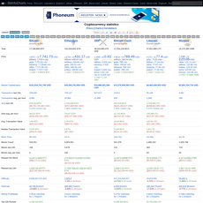
Woobull Charts Review

Woobull Charts
charts.woobull.com
Woobull Charts Review Guide: Everything You Need to Know (with FAQ)
Ever wondered how on-chain charts can flag Bitcoin tops and bottoms before price does? In this guide, I’ll show you how I use Woobull Charts to read the market with more confidence, avoid FOMO, and build a simple plan that fits your style.
If you’ve ever chased a breakout that reversed the next day, sold a bottom because Crypto Twitter felt apocalyptic, or stared at ten different indicators that said ten different things, you’re not alone. The signal exists—it’s just buried under noise. Woobull’s edge is that it trims the noise and gives you a few time-tested metrics you can actually use.
The pains Woobull can actually solve
Bitcoin can move fast, but that doesn’t mean you need to. Most mistakes come from either listening to the wrong signals or reacting too quickly. Here’s where Woobull helps:
- FOMO and panic cycles: On-chain ratios like NVT/NVTS historically ran “hot” near cycle tops and cooled near bottoms. That context is a brake pedal when your emotions want to floor it.
- Too many tabs, not enough clarity: Instead of bouncing across a dozen dashboards, Woobull narrows the menu to models that have shown real, long-horizon value.
- Paywalls and jargon: You want straight answers without a PhD or a subscription. Woobull’s charts are public, and the descriptions keep things human.
- Overtrading: Most short-term chops disappear when you look at daily/weekly trend context. That alone can save fees, stress, and bad entries.
Real-world examples that won’t shock anyone who’s been here a while:
- 2018 bear market: As price fell into December, long-term on-chain valuation bands (like CVDD, which tracks value transacted by older coins) came into play near the eventual bottom around $3k. Many traders who watched those bands scaled in while sentiment was at its worst.
- 2021 top risk: Several longer-horizon signals warned that risk was elevated during the spring peak. While nothing calls the exact day, seeing “overheated” regimes helped people de-risk into strength instead of buying late.
- 2022 capitulation: Deep undervaluation readings returned. If you had a plan to accumulate when those bands lit up, you didn’t need to guess the final wick—you just needed to follow your sizing rules.
Simple rules beat complex guesses. The point isn’t to predict every move—it’s to be roughly right when it matters and protect yourself when it doesn’t.
My promise: a simple, practical path
I’m not going to bury you in indicators. I’ll keep this focused and useful. Here’s what I’ll stick to:
- Plain-English explanations of the handful of Woobull charts worth your time.
- Actionable checkpoints you can turn into a weekly routine—no 24/7 screen-watching required.
- Risk-first thinking so signals become context, not triggers to YOLO.
By the end, you’ll know exactly which metrics to track and how they fit into a simple checklist for entries, exits, and risk.
Who’s behind Woobull and why it matters
Woobull is curated by Willy Woo, one of the earliest voices to popularize on-chain models like NVT and NVTS. That curation matters. Instead of a firehose of experimental indicators, you get charts that have been battle-tested across multiple cycles and discussed widely in the community.
To be clear, no model is perfect. But when a signal is both transparent and widely followed, it tends to be more practical. Over the years, metrics like NVT-based tools and CVDD have been referenced by analysts, fund letters, and educational sites because they’re easy to understand and compare across cycles. That shared language helps you stay grounded when the timeline gets loud.
What you’ll get from this guide
If you’re here to save time and make better decisions, you’re in the right place. I’ll give you:
- A fast tour so you know exactly where to click at charts.woobull.com and what to read first.
- Top indicators in plain English—what they mean, why they matter, and where they’ve helped in the past.
- Practical use-cases like “scale out into heat” and “accumulate in undervaluation zones.”
- Pros and cons so you know the limits and don’t overfit your strategy.
- A quick-start playbook you can run weekly in under 10 minutes.
- FAQ answers to the questions I get the most, all in one place.
Ready to cut the noise and see how the site actually works without wasting time? In the next section, I’ll show you where everything lives, how to read the page notes, and how to switch between models without losing context—want to see that now?
What is Woobull Charts and how the site works
Woobull Charts is a curated hub of Bitcoin-focused on-chain and market structure visuals hosted at charts.woobull.com. It’s built to strip out noise and give you long-horizon signals that actually help with timing big decisions. No clutter, no endless indicator rabbit holes—just the models that keep showing up at cycle tops and bottoms.
“Simple beats complex when your money’s on the line.”
I keep Woobull open as my “market compass” on weekly review days. It’s not trying to predict every wiggle; it frames the bigger picture so you don’t get tossed around by headlines or 5-minute candles.
Quick tour: layout, navigation, and chart pages
Getting around is fast. The homepage lists a handful of core Bitcoin models. Click any title and you land on a single chart page with just the essentials:
- Model description — a short explainer that tells you what the chart measures and why it matters, in plain English.
- The chart — clean visuals with long-term price overlaid on the model. Expect color bands or lines that highlight overheated vs. undervalued zones.
- Legend and overlays — color keys and simple toggles to declutter or compare signals. If a band or line confuses you, the legend resolves it in seconds.
- Annotations — callouts at historical tops/bottoms so you can see how the model behaved at real inflection points.
- Notes and update info — a short line about data freshness (typically daily) and any caveats you should know.
My quick workflow looks like this:
- Open a chart page from the homepage (for example, one of the valuation or cycle tools).
- Skim the description first. That one paragraph saves you from misreading the signal.
- Check the legend to map colors to meaning. If I need clarity, I toggle overlays to isolate the key line or band.
- Scan the annotations to see how the signal reacted at prior extremes. I’m asking: did this help catch the last two cycles?
Tip: if you’re hopping between charts, use your browser tabs for side-by-side comparison. Seeing how two models line up at the same dates is where the “aha” moments happen.
What makes it different from generic chart sites
Most chart platforms give you every tool under the sun and leave you guessing which ones matter. Woobull flips that script with fewer, higher-quality models and a narrative that stays focused on investor timeframes. A few things stand out:
- Signal over spectacle — no “indicator buffet,” just battle-tested concepts that map to Bitcoin’s adoption and liquidity dynamics.
- Cycle-first framing — charts are built to highlight long-horizon heat/undervaluation, not intraday spikes.
- Context you can act on — each page explains what the signal is actually saying, so you can translate it into entries, scale-outs, or simply “do nothing.”
- Less noise = fewer mistakes — by narrowing the toolkit, you reduce analysis paralysis and the urge to overtrade.
This “fewer, better” approach aligns with what I’ve seen in broader on-chain research: metrics rooted in transaction volume, realized value, and coin aging tend to correlate with investor behavior over full cycles. If you want to read around the topic, reports like Coin Metrics’ State of the Network and Glassnode’s Academy pieces are useful primers on why these constructs work across years, not days. See: Coin Metrics SOTN, Glassnode Academy.
Data sources and update cadence
Woobull emphasizes higher-timeframe clarity, so you’re looking at daily or weekly-resolution data rather than intraday noise. In practice that means:
- On-chain inputs — Bitcoin blockchain settlement metrics (e.g., USD-denominated volume, coin dormancy/age effects) and supply-derived valuations.
- Market inputs — price and market cap from reputable index feeds to align on-chain activity with market pricing.
- Update rhythm — most charts recalc once per day, with some using weekly smoothing for stability. I treat Woobull as a daily or end-of-week dashboard, not a scalping tool.
The cadence matters. Daily updates give signals time to mature, which helps filter fakeouts. I often screenshot the same charts once a week; when the big lines bend or bands are tagged, it means something.
If a website could take a deep breath for you, this is it. Now the fun part: which specific Woobull indicators deserve a spot on your weekly checklist—and how do you read them without second-guessing yourself? Let’s open them up next.
The core Woobull Bitcoin indicators (and how to read them)
I keep a handful of Woobull Charts on my weekly radar because they cut through noise and keep me anchored to the cycle. Below is how I read each one in plain English, where I’ve seen them shine, and what I watch for when they start to disagree with price.
“In the short run, the market is a voting machine, but in the long run it is a weighing machine.”
— Benjamin Graham
NVT Ratio and NVTS (NVT Signal)
What it is: NVT compares Bitcoin’s market cap to the USD value settled on-chain. NVTS smooths on-chain volume with a moving average (commonly 90 days) so you’re tracking the trend, not day-to-day noise. High NVT/NVTS = price running ahead of on-chain settlement; low = on-chain activity is strong relative to price.
How I read it:
- Elevated and rising: speculative heat. If NVTS pushes into historically hot territory and then rolls over while price still climbs, that’s a classic exhaust signal.
- Compressed and basing: foundational strength. Strong or improving settlement volume vs market cap can precede expansions.
Real-world context I’ve seen:
- 2017 top: NVTS reached a historically elevated zone ahead of the blow-off and faded as price tried to keep running.
- 2021 double top: NVTS cooled materially into the November high while price made new highs — a warning that on-chain demand wasn’t keeping up.
- 2018 and 2022 bear markets: NVTS reset to comparatively low zones as network settlement stabilized, laying groundwork for later recoveries.
At a glance:
- Rising NVTS + rising price = ok, but don’t ignore extremes.
- Falling NVTS + rising price = risk of a tired rally.
- Rising NVTS + flat price = constructive; watch for a breakout.
Want to see the live model? Check Woobull’s NVT resources here: NVT Ratio and the NVTS variant on the same site.
NVT Price
What it is: A valuation model that turns NVT into a “fair value” price line. Think of it like a long-term gravity line for BTC based on how much value the chain is actually settling.
How I read it:
- Price far above NVT Price: market exuberance; gains may be ahead of on-chain utility.
- Price near/below NVT Price: value catching up; historically, those zones have produced better long-term entries.
Real-world context I’ve seen:
- March 2020 crash: price flushed toward the NVT Price line, then mean-reverted as on-chain settlement rebounded.
- 2022 bear market: multi-month proximity to or under-shoots of NVT Price signaled deeper value relative to activity.
Pro tip: I track the percentage distance from NVT Price. Extended stretches at large positive premiums are where I get more cautious; sustained negative premiums are where I get more curious.
CVDD (Cumulative Value Days Destroyed)
What it is: A long-horizon band derived from “coin days destroyed” and value — a proxy for how older coins are moving relative to network valuation. It captures when long-term holders have transferred enough value to statistically wash out weak hands.
How I read it:
- Price tagging or wicking into the CVDD band: historically associated with cycle floors.
- Staying well above CVDD: bull phases have room; the floor is far below.
Real-world context I’ve seen:
- 2015, 2018/19, 2022: CVDD acted like a “last stand” zone. Price either tagged or approached the band during capitulation and then based.
Important nuance: I don’t treat CVDD as a guarantee — I treat it as a statistically meaningful area where long-term value transfer has historically cleared the decks.
Top Cap and other long-term bands
What it is: Frameworks like Top Cap (a multiple of average cap) and companion bands aim to frame cycle extremes from above and below. They’re not timing tools — they’re context for heat and risk.
How I read it:
- Approaching Top Cap: risk builds; I mentally shift from offense to defense and demand stronger confirmation to add exposure.
- Mid-band meandering: normal cycle expansion/consolidation.
Real-world context I’ve seen:
- 2013 and 2017: near or direct interactions with Top Cap coincided with cycle peaks.
- 2021: price didn’t quite tag the classic Top Cap line on some variants, but the “heat” read was clear enough to tighten risk.
How I actually use it: as a ceiling probability gauge. If we’re living under Top Cap with NVTS cooling, I’m not chasing late-stage moves without a plan.
On-chain volume and velocity context
What it is: Settlement volume and velocity track whether the network is moving value in size. Woobull’s emphasis on these metrics ties back to why NVT/NVTS work at all: price should ultimately reflect utility.
How I read it fast:
- Rising on-chain settlement + flat price: constructive accumulation. The chain is getting “heavier.”
- Falling settlement into strength: rallies driven by leverage/speculation rather than organic usage tend to be fragile.
- Rising velocity after a reset: early cycle fuel — especially when funding and perp premiums aren’t running hot.
Real-world context I’ve seen:
- 2019 Q2 rally: settlement and velocity improved alongside price — a healthier advance.
- Spring 2021: on-chain settlement cooled while price ripped and derivatives overheated — the “weak foundation” combo that preceded a sharp drawdown.
Why this matters: these volume dynamics feed straight into NVT/NVTS and the valuation bands above. When they line up, you get clarity. When they don’t, you get warning lights.
Quick pattern cheat sheet I keep:
- NVTS rolls over from elevated + price makes new high + falling on-chain volume = caution.
- NVT Price converges with spot + CVDD below as support + rising settlement = constructive base building.
- Approaching Top Cap + NVTS extended + euphoric funding elsewhere = scale risk, not FOMO.
If these reads make sense, the next step is turning them into a simple, repeatable checklist. Want to see the exact rules I use when NVTS rolls over, volume diverges, and price leans into a long-term band — including how I size and time entries and exits?
How I actually use Woobull in a strategy
When I open Woobull Charts, I’m not chasing a magic line. I’m running a simple playbook so I can act when the market is loud and I’m tempted to do something dumb. If you’ve ever felt the whiplash of FOMO and fear, this part is for you.
“The market is a device for transferring money from the impatient to the patient.” — Warren Buffett
Here’s exactly how I turn Woobull’s long-term signals into entries, exits, and risk rules I can stick to on a sleepy Sunday or a manic Monday.
Long-term investor playbook
I treat on-chain as my thermostat. When it says “cold,” I accumulate. When it says “too hot,” I lighten up. No hero calls, just consistent behavior.
- Accumulate when “cold”: I add size when price tags or hovers above CVDD or sits in clear undervaluation zones on models like NVT Price. Historically, the CVDD band marked major floors in 2015 (~$200), late 2018 (~$3.2k), and late 2022 (~$15–17k). I don’t need the exact wick—being roughly right beats being precisely late.
- Throttle DCA with signal strength: My weekly DCA increases if price is near CVDD/undervaluation and on-chain settlement is rising. If signals are neutral, I keep base DCA. If we’re “hot,” I reduce or pause.
- Scale out into “hot”: When NVTS stretches, on-chain volume fades into strength, and we approach long-term “top-ish” bands (e.g., Top Cap heat), I start trimming in predefined steps (e.g., 10–20% per ladder rung). The goal isn’t to snipe the top; it’s to bank gains while the crowd is euphoric.
- Time-based recheck: I review weekly. If signals don’t change, I don’t change my plan. Boredom is a feature, not a bug.
Real example: In November 2022, CVDD flashed “deep value.” I increased my DCA for 8 weeks, then held steady into 2023. As NVTS extended and cyclical heat built into Q1–Q2 2024, I scaled out in 3 rungs. Was it perfect? No. Was it emotionally effortless? Shockingly close.
Swing trader playbook
For swings (days to weeks), I wait for confluence and I measure risk first.
- Setup I look for:
- NVTS rolling over from elevated readings
- On-chain settlement weakening while price pushes up (fragile rally)
- Price rejection at a long-term band (e.g., Top Cap zone) or a major HTF resistance
If I see 2–3 of these together, I de-risk longs, consider a short-term hedge, or wait for a cleaner long later. - Confirmation rules: I want a weekly or daily close that respects my level. If price wicks above resistance but closes back under, that’s my green light to stay cautious.
- Invalidation: If NVTS re-accelerates and settlement expands with price breaking and holding above resistance, I drop the counter-bias fast. No ego trades.
- Exit logic: Time-based stops are my friend. If a swing idea goes nowhere in 10–15 sessions, I cut it or tighten aggressively. Flat is a position.
Real example: In early 2021, NVTS signaled “hot,” on-chain settlement started to lag the final push, and price struggled near prior projected heat zones. That confluence had me reduce spot exposure and hedge a slice. I didn’t top-tick anything—but I slept.
Combine Woobull with price structure
On-chain gives me the “why,” price gives me the “when.” I don’t act unless both agree.
- Levels that matter: Weekly support/resistance, the 20- and 200-week moving averages, prior cycle highs/lows. I map these on TradingView.
- Spot vs. derivatives: I check funding, open interest, and spot CVD on my exchange or analytics tool. If Woobull says “hot,” but funding is neutral and spot leads, I stay patient. If funding is frothy and spot lags, the risk is higher.
- Trigger example:
- Long-biased: NVTS cools from elevated readings, settlement expands, and price reclaims the 200W MA → I scale in across 2–3 tranches with a time stop.
- Risk-off: NVTS overheated + falling settlement + weekly rejection at resistance → trim, set hedge, or tighten stops on existing longs.
The beauty is how clean this becomes. If the on-chain “weather” and price “roadmap” disagree, I just wait. No trade often beats a forced trade.
Risk management and expectations
On-chain can lead or lag. That’s okay. I treat Woobull as context, not a signal to go all-in or all-out.
- Position sizing: My single-idea risk is small (often 0.5–1.5% of account). Long-term buys are in chunks, never one shot.
- Staggered moves: Three rungs in, three rungs out. I pre-write the rungs before the emotion hits.
- Time-based stops: If the thesis hinges on a weekly condition and it doesn’t show within two candles, I scale down or exit. “When” is part of “what.”
- Scenario planning: I keep two plans ready:
- Heat keeps rising → trim/hedge, trail stops, avoid chasing.
- Heat cools but price holds → build position slowly; let strength prove itself.
- Guardrails against narrative traps: I never override my plan because of headlines. If the chart disagrees with Twitter, I trust the chart.
For extra confidence, I like to back-check: CVDD’s proximity to price aligned with the 2015, 2018, and 2022 capitulations; NVTS extremes lined up with overheated phases in 2013, 2017, and 2021. It’s not perfect, but it’s consistent enough to build rules around—especially when combined with structure and prudent sizing.
One more thing—this is how I use it. It’s not financial advice, and you shouldn’t outsource your judgment. The win here is consistency: fewer, better actions.
Curious how fast you can put this into your daily routine—and whether Woobull is free, mobile-friendly, or has alerts? That’s exactly what I’m breaking down next. Ready to make this practical in minutes?
UX, access, and practical notes
Is Woobull free? Mobile? Shareable?
Short answer: yes, yes, and yes.
- Free: You can browse the entire site without logging in or paying. No paywall. Just charts that load quickly at charts.woobull.com.
- Mobile: It’s lightweight and smooth on phones. I often check NVTS and CVDD on my morning train—pinch/zoom works fine. That said, a larger screen helps you read annotations and long-term bands at a glance.
- Shareable: Every chart has a clean, permanent URL, so sharing is dead simple. For example:
- NVT Ratio
- NVTS (NVT Signal)
Paste the link into a chat and your friend lands on the exact chart with the same story you’re seeing.
“Simplicity is the ultimate sophistication.” — Leonardo da Vinci
I’ve seen firsthand that fewer, clearer choices reduce hesitation. The classic “jam study” found shoppers were far more likely to buy when offered 6 jams instead of 24 (Iyengar & Lepper, 2000). That’s the feel here: a focused set of high-signal charts that lower analysis paralysis.
Alerts, exports, and APIs
There are no native alerts or official API on Woobull. Here’s how I handle it:
- TradingView alerts (workaround):
- Use Woobull to mark levels/zones (e.g., where NVT Price suggests undervaluation or where NVTS historically overheats).
- On TradingView, set price alerts at those levels or on higher-timeframe structure that aligns with the Woobull context.
- For on-chain alerts specifically, look for community scripts or connect data from providers that integrate with TradingView.
- On-chain alert platforms:
- Glassnode and CryptoQuant let you create metric-based alerts (e.g., NVTS crossing a threshold, exchange inflows spiking). This is the easiest way to recreate Woobull-like prompts with notifications.
- Santiment also supports alerts on social/on-chain signals, which pairs nicely with a Woobull macro read.
- Low-tech notifications: If you just want a ping when a chart page changes, use a change-monitor like Distill on a specific Woobull URL.
- Exports: No CSV/download from Woobull itself. If you need raw series, pull similar data from Glassnode/CryptoQuant and keep Woobull for interpretation and context.
My real-world flow: I check Woobull weekly for the big picture, then set a few TradingView alerts to act if price enters those zones. It keeps me from staring at the screen but still ready to move.
Who it’s for vs who it’s not for
- Perfect for: Long-term investors and swing traders who think in days/weeks. If you like a calm compass instead of an adrenaline rush, Woobull fits.
- Less useful for: Intraday scalpers. There’s no tick-level data, no DOM, no order flow. If the 1-minute chart is your heartbeat, you’ll feel underfed here.
Think of it as your macro dashboard. It won’t place trades for you, but it will quietly keep you out of the worst FOMO and fear.
Alternatives and complements
- LookIntoBitcoin: Free, readable cycle tools (Pi Cycle Top, 2-Year MA Multiplier, and more). Great visual companions to Woobull’s long-horizon story.
- Glassnode: Deep, downloadable on-chain metrics with alerts. Ideal if you want to quantify what Woobull hints at and run your own tests.
- CryptoQuant: Strong exchange/flow/ETF/institutional trackers with alerting. Useful for catching regime shifts or risk events.
- Santiment: Social sentiment, developer activity, and network health—helpful to confirm when euphoria or apathy is creeping in.
- TradingView: Execution, alerts, and multi-asset structure. I translate Woobull zones into actionable alerts here.
Pro tip: Pair one “compass” (Woobull) with one “microscope” (your exchange/TradingView) and one “data warehouse” (Glassnode/CryptoQuant). That mix covers story, timing, and evidence.
About the “Bitcoin Supplier Model”
You’ll see the “Bitcoin Supplier Model” mentioned around the community. It’s a separate framework (not a native Woobull chart) that aims to map better buy/sell windows for different participant profiles.
- How I treat it: A second opinion. If it agrees with Woobull’s undervaluation/overheating zones, I size in/out more confidently. If it conflicts, I slow down and wait for clarity.
- Why separate matters: Don’t mash tools together and call it confirmation. Use it as an external lens, not a hidden layer inside Woobull.
One signal is a whisper. Two uncorrelated signals feel like a conversation.
Still wondering things like “How often do these charts update?” or “Can I get alerts straight from Woobull?” I’ve got quick, no-fluff answers next—want the fast list?
FAQ: straight answers to common questions
What is the NVT of Bitcoin?
NVT stands for Network Value to Transactions. It’s the ratio of Bitcoin’s market cap to the USD value settled on-chain each day. Think of it like a “price-to-network-activity” gauge.
Formula: NVT = Market Cap ÷ Daily USD On‑Chain Volume
When NVT is high, price may be running ahead of actual settlement activity; when it’s low, network activity is “rich” relative to market value.
Real-world context:
- Late 2017 and early 2021 peaks saw extended, elevated NVT/NVTS zones before notable pullbacks.
- Capitulation phases (e.g., late 2018 and late 2022) tended to show compressed readings as value settled rose relative to price.
See Woobull’s explainer and chart here: http://charts.woobull.com/bitcoin-nvt-ratio/
How is NVTS different from NVT?
NVTS (NVT Signal) smooths the raw NVT by applying a moving average to on-chain volume. That filtering cuts the day‑to‑day noise and often gives cleaner “overheated/undervalued” reads.
How I use it in practice:
- Rollover risk: When NVTS is elevated and starts to roll over while price grinds up, I get cautious.
- Recovery hints: After washouts, a flattening or rising NVTS from depressed levels is a constructive early tell.
Historical examples (not signals, just context): NVTS was stretched into December 2017 and again into Q1–Q2 2021; it compressed into late 2018 and late 2022 as bear markets matured.
What is the Bitcoin Supplier Model?
It’s an external framework (not native to Woobull) that maps buy/sell timing for different user profiles. I treat it as a separate lens to compare against Woobull’s long-term bands like NVT Price or CVDD. When both point the same way, that confluence boosts confidence; when they disagree, I slow down and size smaller.
Is Woobull only for Bitcoin?
Yes—primarily Bitcoin. The charts focus on BTC’s on-chain settlement dynamics and macro market structure, which is why the signal quality is so high for longer horizons.
How often do charts update?
Most Woobull charts update daily (some are best viewed weekly). Plan for decisions in days and weeks, not minutes and hours. If timing matters to you, check the chart’s footer or last candle timestamp; daily updates typically reflect data as of the prior day’s close (UTC-like cadence).
Can I get alerts from Woobull?
There are no built-in alerts. I recreate the logic elsewhere and set notifications. Simple examples:
- NVTS threshold: Alert when NVTS crosses above/below levels you consider “hot” or “value.”
- NVT Price touch: Alert when price tags or reclaims the NVT Price band you track.
- Confluence: Use a checklist—if NVTS turns down + price into a long-term band + on-chain volume fades, trigger a “review” alert to reduce risk or hedge.
Is this financial advice?
No. These are research tools. I use them as context, then apply position sizing, scaling rules, and time-based exits. Markets can and will ignore “fair value” longer than we like—risk controls first, always.
See also
I keep a running list of helpful tools and reads here:
Quick question before we continue: if you had a 10-minute weekly routine that turned these signals into simple actions, would you use it? Good—because that’s exactly what I’m about to show you next.
Put Woobull to work in 10 minutes
Quick-start checklist
I keep this setup fast, repeatable, and low stress. Do this once, and you’ll be ready for a weekly 5–10 minute check-in.
- Open:charts.woobull.com and search for NVTS, NVT Price, and CVDD. Bookmark all three.
- Create two browser folders: “Woobull — Weekly” (NVTS, NVT Price, CVDD) and “Price Structure” (your BTCUSD weekly chart on TradingView or similar).
- Add a calendar reminder: Sunday evening or Monday morning: “Woobull 10-min review.”
- Open NVTS: Note where it sat near past tops and bottoms. You don’t need numbers—just mark the zones visually.
- Open NVT Price: Identify times when price was far above or below the model line. Add a note: “Overvalued zone = consider trimming; Undervalued zone = consider adding.”
- Open CVDD: Look at historical bear markets (2015, 2018, late 2022). Notice how price interacted with the CVDD band. Add: “If price tags this band, I increase DCA.”
- Open your weekly BTC price chart: Draw two levels: the nearest major support and resistance. Save.
- Write a 3-line rule card: one for adding, one for trimming, one for doing nothing. Tape it near your screen or save as a pinned note.
- Commit to the cadence: Check these charts weekly, not daily. These are slow signals by design.
- Optional bonus: Share a private link to your three Woobull bookmarks with a trusted friend and compare notes once per month. Keeps you honest.
Your personal signal map
Here’s the simple map I use. Adjust the wording to fit your risk tolerance and time horizon.
NVTS (overheating/relief context)
- Overheated: NVTS pressing into the upper zone it reached near prior cycle tops, especially if price is vertical. My rule: trim 10–20% into strength when NVTS is extended for multiple weeks.
- Neutral: NVTS mid-range, no new extremes. My rule: hold core; only rebalance if price hits a major weekly level.
- Undervalued/relief: NVTS washed out or basing after a big drawdown. My rule: restart DCA or add 1–2 extra buys on red weeks.
NVT Price (valuation anchor)
- Overvalued: Price stretched far above NVT Price for weeks. My rule: scale out in 10% chunks on weekly closes, never all at once.
- Neutral: Price oscillating near NVT Price. My rule: accumulate only via regular DCA; avoid big bets.
- Undervalued: Price near or under NVT Price. My rule: increase DCA size 1.5–2x for a set number of weeks.
CVDD (cycle floor guardrail)
- Near/Touching: Historically aligned with deep bear market lows (e.g., late 2022 tag). My rule: deploy a pre-defined “bear allocation” in tranches while it stays near the band.
- Far Above: No action by itself; use NVTS/NVT Price and price structure for trims or patience.
Sample pre-written rules (steal these and make them your own):
- Add: “If price closes the week within ~10% of NVT Price or the CVDD band, I add +1 unit DCA. If both align, add +2 units.”
- Trim: “If NVTS is elevated and price is at weekly resistance, trim 10% on the next green weekly close. If NVTS rolls over from that zone, trim another 5–10%.”
- Do nothing: “If signals conflict (e.g., NVTS hot but price at strong support), hold core and wait for next week’s close.”
Why this works: you aren’t guessing. You’re reacting to known zones that have lined up with cycle extremes multiple times, while letting weekly price structure keep you from overtrading.
Pro tip: keep a market journal
“Plan the trade; trade the plan.” A simple journal kills hindsight bias and FOMO.
- Once a week: take one screenshot each of NVTS, NVT Price, CVDD, and your weekly BTC chart.
- Add one sentence per chart: “NVTS extended again; trimming plan intact.” or “Price near NVT Price; add 1 unit DCA.”
- Track outcomes: Note what you actually did. Next month, compare decisions vs. signals.
A light journal is enough to spot patterns fast. Behavioral finance research consistently shows that written rules reduce emotional decisions in volatile markets. You don’t need a novel—just receipts.
Final word: build a calm, repeatable routine
These charts shine when you treat them like a compass, not a siren. Keep the setup clean, review weekly, and let your pre-written rules handle the heavy lifting. When NVTS screams hot, you already know how much to trim. When NVT Price and CVDD say “cheap,” you already know how much to add. That’s the game: fewer decisions, made better.
I’ll keep stress-testing new models and sharing what actually helps on cryptolinks.com. If you found this useful, bookmark it, lock in your rule card, and I’ll see you at next week’s review.